
Storybook has long been the go-to tool for building, testing, and documenting UI components in isolation. With the release of Storybook 9, it takes another major leap forward—streamlining setup, supercharging testing, and aligning with modern frameworks like never before. Whether you’re building design systems or refining complex UIs, Storybook 9 will elevate your workflow.
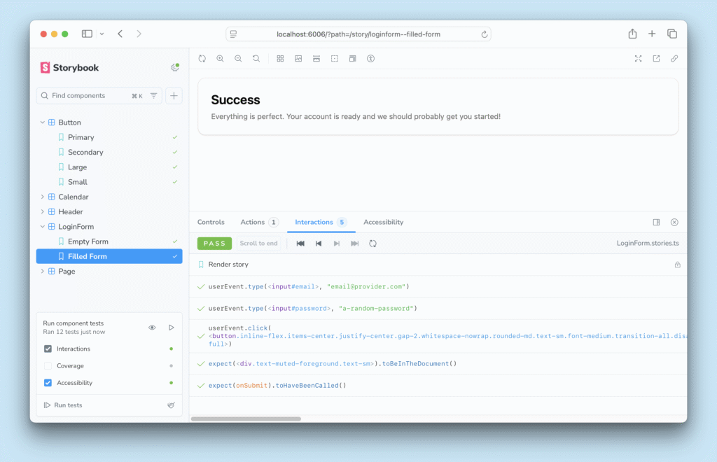
- ▶️ Interaction tests: Verify functionality by simulating user behavior
- ♿ Accessibility tests: Detect, diagnose, and fix WCAG violations
- 👁️ Visual tests: Check for appearance bugs down to the pixel
- 🛡️ Coverage reports: Understand which code is tested at a glance
- 🚥 Test widget: Click to run a comprehensive test suite
Stories Are Now Tests
One of the most groundbreaking changes in Storybook 9 is the evolution of stories into testable units. Your existing stories can now double as functional tests, thanks to improved integration with tools like Playwright and Jest.
The new play function enables you to simulate user interactions within stories:
// Button.stories.tsx

export const Clicked = {

args: { label: 'Click me' },

play: async ({ canvasElement }) => {

const canvas = within(canvasElement);

await userEvent.click(canvas.getByText('Click me'));

expect(canvas.getByText('Clicked!')).toBeInTheDocument();

},

};
No extra configuration is needed—your visual test doubles as a behavioral test, blurring the line between documentation and QA.
Zero-Config Setup for Popular Frameworks
Storybook 9 dramatically simplifies the setup process. It now offers zero-config support for frameworks like:
- Next.js (including App Router)
- Vite
- SvelteKit
- SolidJS
Simply run npx storybook@latest init in your project, and it auto-detects your stack, scaffolds config files, and gets you up and running in seconds.
First-Class React 19 Support
With React 19 and the new use() hook, the frontend landscape is evolving. Storybook 9 keeps up by offering native support for React Server Components (RSC) and the use() pattern.
This means you can:
- Preview server-driven components without hacks
- Test components that fetch data during render
- Align Storybook usage with the latest React paradigms
If your developer team is exploring React 19, Storybook 9 is the perfect visual companion.
Smaller Bundles, Faster Loads
Storybook 9 has been optimized under the hood:
- Reduced bundle sizes
- Improved startup times
- Smarter lazy-loading of stories
The result is a faster, lighter experience — whether you’re using it locally or deploying Storybook as a style guide or documentation hub.
UI Improvements That Matter
Beyond features, Storybook 9 introduces subtle but impactful UI updates:
- Revamped sidebar navigation
- Better keyboard accessibility
- Smoother dark mode toggle
These polish enhancements make Storybook feel less like a dev tool and more like a modern IDE for your components.
Visual + Functional Testing, Unified
Testing no longer requires switching tools. With Storybook 9:
- Visual tests (via Chromatic or screenshots) ✅
- Interaction tests (via play function) ✅
- Accessibility checks ✅
All this happens in the same visual workspace. It’s not just testing—it’s confidence-driven development.
Migration & Adoption Tips
Upgrading is simple:
npx storybook@latest upgrade
For existing users:
- Review your .storybook/main.js config for deprecated fields
- Update your framework presets (e.g., @storybook/nextjs)
- Leverage the play function in key stories
Summary
Storybook 9 is more than an upgrade—it’s a shift in how we build and validate UI. It transforms your stories into single-source artifacts for design, documentation, and testing.
If you’re serious about frontend engineering, Storybook 9 should be in your toolkit.
Ready to level up your component development? Give Storybook 9 a spin and experience the future of UI development today.


